


Whether it’s about a simple landing page, an e-commerce app platform or your company’s internal dashboard, using a library of pre-made icons and components is highly beneficial. There are many other icon libraries out there which can ease your work but one of the largest and the most popular one is the Material UI (or recently named MUI) icon library.
If you are new to Material UI library, it provides you with a robust, customizable, accessible and advanced components, enabling you to build your own design system and develop React applications faster. That includes a huge list of Material icons.
Material UI icons or MUI currently have over 1900 icons based on Material Design guidelines set by Google. So let’s see how to use them in a React application. Let’s begin!
Getting started with Material Icons in a React app
Let’s get our hands dirty with some actual coding where our React app uses the Material Icons (MUI) package.
What we will be making?
Our demo will be a very basic one. Basically, a component where we display three of the common items found in a typical webpage;
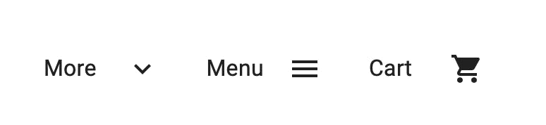 As you can see, we have three items:
- The “More” dropdown item.
- The “Menu” hamburger item.
- The “Cart” icon.
Here we are using the Material Icons alongside the texts.
Step 1: Start a New React Project
Make sure you have Node.js installed on your system and then run the following commands:
npx create-react-app mui-demo
cd mui-demo
npm start
This will bootstrap a new React application and run the default app on http://localhost:3000/ in your default browser thanks to the Create React App tool.
Step 2: Install Material UI(MUI) package
Before we start adding these icons, we need the core MUI package because all these icons uses the MUI SvgIcon component to render the SVG path for each icon. For each SVG icon, we export the respective React component from the @mui/icons-material package.
Run the following command from your terminal:
npm install @mui/material @emotion/react @emotion/styled
Or if you are using Yarn:
yarn add @mui/material @emotion/react @emotion/styled
Step 3: Install Material Icons Package
Now we can install the icon package with the following command
// with npm
npm install @mui/icons-material

// with yarn
yarn add @mui/icons-material
Step 4: Start Using MUI Icons!
Simply head over to the app.js file and delete all the existing code. We will be writing everything from scratch.
Let’s start with the responsive Grid layout component which will contain all of our elements inside. This is useful for different screen sizes and orientations which uses CSS Flexbox under-the-hood.
So under the return() method, we should have <Grid> component. This can have its props or custom styles attached to it:
<Grid container></Grid>
Now we need six new child <Grid> components to hold our icons with the text lables (one for each of the three). Make sure you pass in the item prop to each of them.
<Grid item xs={1}></Grid>
Within each of these, we have a component holding the text label
<Typography>More</Typography>
As for the actual MUI icon component we will create a duplicate child item but the only thing changed here will be the actual icon component name. By now we should have the following code:
import * as React from "react";
import Grid from "@mui/material/Grid";
import Typography from "@mui/material/Typography";

export default function App() {
  return (
    <Grid container sx={{ color: "text.primary" }} >
      <Grid item xs={1}>
        <Typography>More</Typography>
      </Grid>
    </Grid>
  );
}
Let’s see how to find icons we need from the MUI website:
(1) Head over to the Material Icons webpage.
(2) Here you will see a list of icons:
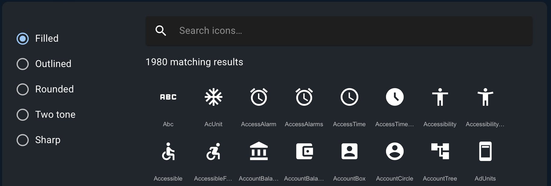
As you can see it has 5 types of icons: Filled, Outlined, Rounded, Two tone, and Sharp. For this demo we only want to use the Outlined one.
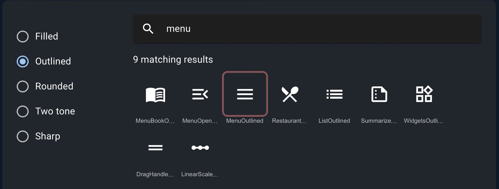
(3) Now let’s search for the four icons by name let’s say the menu icon:
(4) If you click on the selected icon you will be greeted with the following popup:
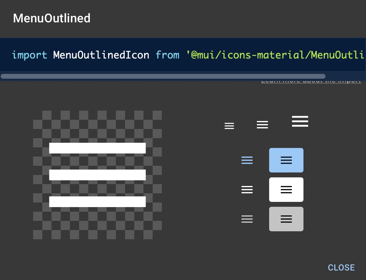
Here you get the icon component’s name along with some variants.
(5) Finally, let’s copy the import statement you see in the modal above so that we can use it on our React application.
Inside the second child <Grid> component we can now safely add the selected icon component as:
import MenuIcon from "@mui/icons-material/Menu";

<Grid item xs={1}>
  <MenuIcon />
</Grid>
Other icon components used for the above demo are:
ExpandMoreOutlinedIcon and ShoppingCartIcon.
If you implemented the above steps successfully, you should have the following code:
import * as React from "react";
import Grid from "@mui/material/Grid";
import Typography from "@mui/material/Typography";
import ExpandMoreOutlinedIcon from "@mui/icons-material/ExpandMoreOutlined";
import MenuIcon from "@mui/icons-material/Menu";
import ShoppingCartIcon from "@mui/icons-material/ShoppingCart";

export default function SvgMaterialIcons() {
  return (
    <Grid container sx={{ color: "text.primary" }} style={{ margin: "10rem" }}>
      <Grid item xs={1}>
        <Typography>More</Typography>
      </Grid>
      <Grid item xs={1}>
        <ExpandMoreOutlinedIcon />
      </Grid>
      <Grid item xs={1}>
        <Typography>Menu</Typography>
      </Grid>
      <Grid item xs={1}>
        <MenuIcon />
      </Grid>
      <Grid item xs={1}>
        <Typography>Cart</Typography>
      </Grid>
      <Grid item xs={1}>
        <ShoppingCartIcon />
      </Grid>
    </Grid>
  );
}
And that should do it! If you followed the above steps carefully, you can see in your browser that React is rendering the corresponding MUI icons as needed.
One of the benefits of using Material UI icons other than the fact that it’s huge with multiple variants is that it is supported by all major platforms, as well as browsers and if you ever get stuck you can definitely check out their GitHub repo. If that’s not enough, they have an entire page dedicated to support.
So go ahead and try to use some other icons available in your project. Hope this short guide helped.
Or you can also browse some of our pre-built react templates that are fully-responsive, interactive, and are loaded with all the important Material UI Icons.